Grapefruit Ten Ways

I recently sat down with one of my favorite fruits and many art supplies to see what I could discover about mark making and my favorite media to use for illustration. These 10 studies were each done in a different media… which one(s) appeal to you most? Pun definitely intended!

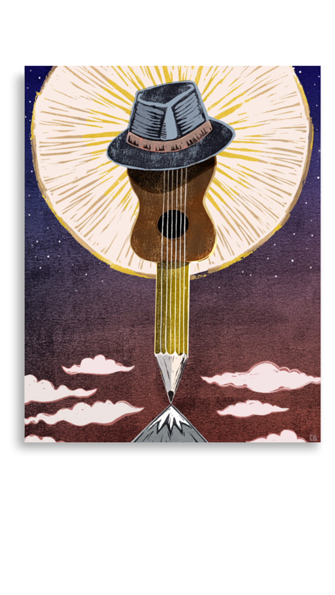
Minnesota Garlic Festival Poster Design 2022

I am honored to announce that the Crow River Chapter of the Sustainable Farming Association has decided to use my hand illustrated poster for the 2022 Minnesota Garlic Festival. I created the poster as part of my graduate curriculum in Illustration at Savannah College of Art and Design (I will write about my transition from being a Graphic Design M.F.A. candidate to Illustration M.F.A. in the next post). After completing the poster, I decided to send it to the S.F.A. Crow River Chapter in the hopes that they might like to use it for this year’s festival… and indeed, they took me up on the offer. I drew the poster and hand lettering using a brush, dip pen and ink, and it was colored digitally in Photoshop.

Family Things: Archiving the History of Loved Objects

What if objects had memory? What would our lives look like from the perspective of the objects that surround us? The objects we carry with us through our lives are layered with stories that are tied to our personal history. However, with the objects that we keep and that have emotional value to us, what of their stories do we ever record? Archiving our personal and family stories along with the objects that are tied to these stories is the goal of a recent design project, called “Family Things”.

Akin to a recipe box, archive cards include a photograph of the significant object with a few factual details about the object. The back of the card tells the story of the object, and includes an image of the person with whom that story is associated. This box can be kept around the house for children, guests, and relatives to browse through, read family stories, and maybe even interact with the objects themselves.

To create a system that allows multiple perspectives to be shared and multiple family members to participate in the creation of the archive, the object cards are created using an online interface. The template allows for a consistent format to the archives created by many people and theoretically for generations to come. It also allows for a digital back-up in case cards would need to be reprinted, or family members in different locations would like to print their own archive.

For the Love Part Deux

My infatuation with block printing continues. I love how each print is different, the textural quality of the ink on paper, and mistakes that happen when the registration is off… for me, it just makes me want to animate them! Here is my latest animated block print.

HyggeAnimation.gif

Shadow Play

Sometimes I will post work produced as part of my coursework, and this particular project - the Shadow Play Project - is an example of that. I began this project as part of a SCAD class, Integrated Design Media, which entailed learning how to tell a multidimensional story across multiple media (aka. transmedia) to a specific audience.

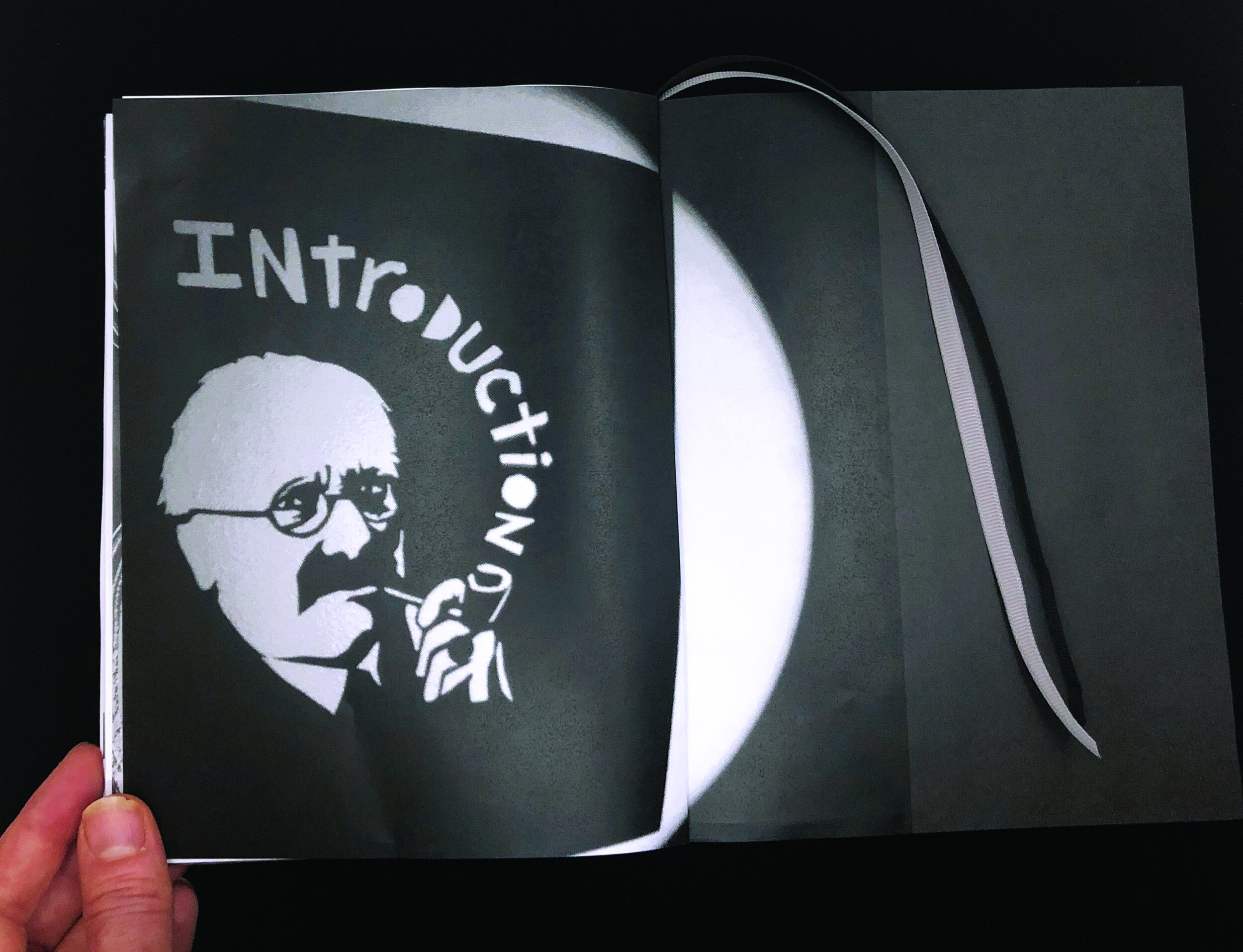
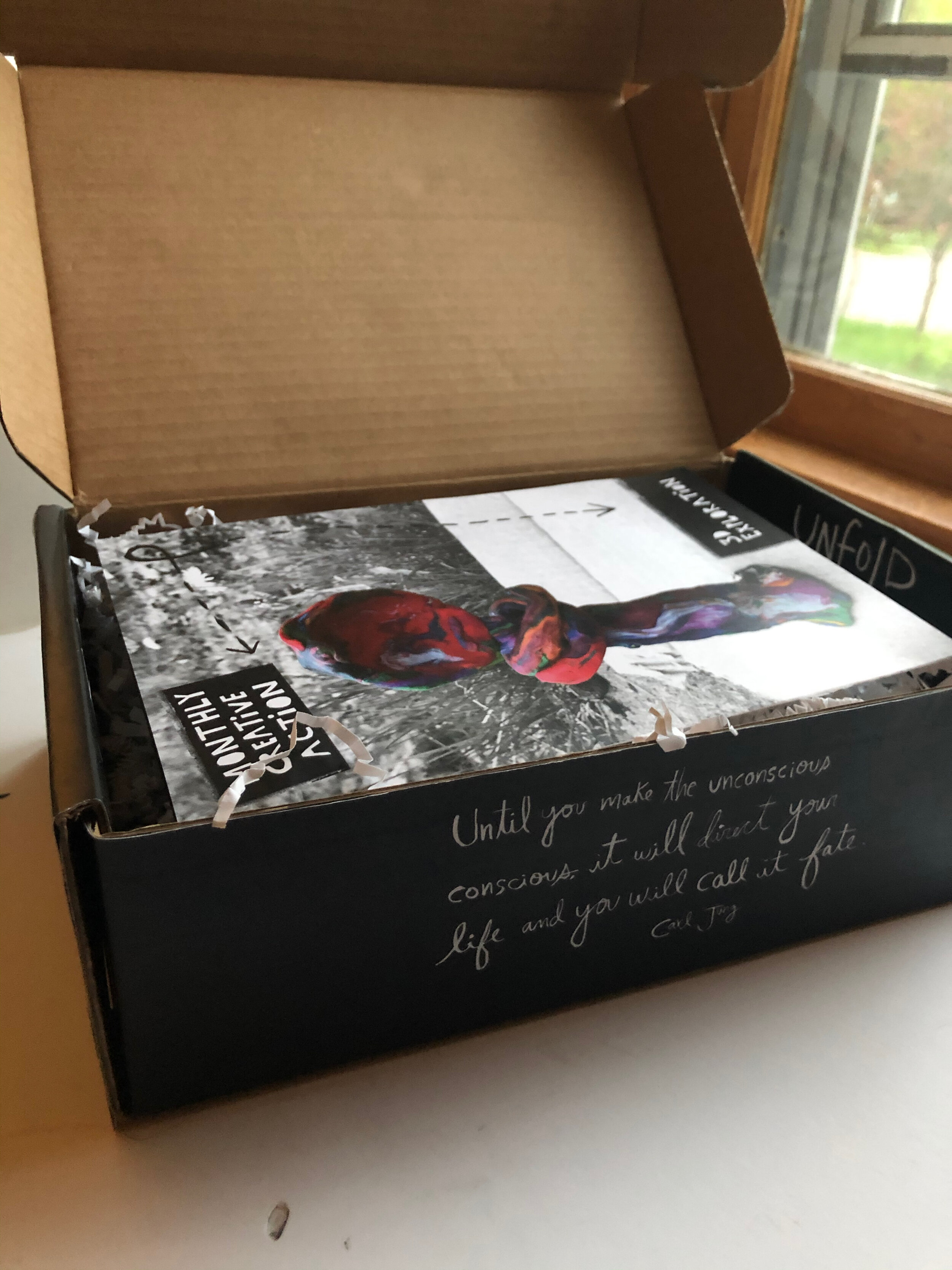
The idea for this project was to introduce the concept of the Shadow Self and create tools to help a person meet and integrate their shadow aspects to achieve wholeness, authenticity and maximum vitality. The tools were a printed journal/handbook called the. Shadow Play Book, The Shadow Play Box: a monthly creative action crate that was a subscription-based shipment of specific adult art and craft supplies aimed at liberating and expressing the shadow self, and a website that tied these elements together with multimedia meditations and additional therapeutic resources.

Encouraged by my professor and classmates, I used shadows as the main visual language and did lots of experimentation with shadows, materials, and lettering before settling on the final pieces that make up these projects. These top two images didn’t make it into the work, but were some of my favorite failed attempts that I thought turned out rather nicely.

Making shadows

Making shadows

Creating this shadow steak was, in the end, not the final solution. However, I was proud of how the texture of the gristle was achieved by using a clear plastic bag attached to the cardstock stencil.

Creating this shadow steak was, in the end, not the final solution. However, I was proud of how the texture of the gristle was achieved by using a clear plastic bag attached to the cardstock stencil.

An Extraordinary Springtime

It is certainly an extraordinary time to be alive right now, and to be a designer. It feels to me that now is a time to contribute whatever we can to creating a better world, to designing healthier social, economic and political systems, to “be the change” we would like to see in the world. Design plays an important role in this. I am not sure how HotHouse fits in to this but I know that it does, we all do. As a human, and as a designer, I will find ways to open up, evolve, and work to create a more healthy, just, and compassionate culture. This is one reason I have chosen to pursue my Masters in Graphic Design and Visual Communication (at Savannah College of Art & Design). I started the eLearning program part-time in March as my family joined the rest of the country in sheltering-in-place. HotHouse was an online business already, so we were able to stay open to assist clients while homeschooling the kiddos and plunging into online grad school. Here’s to getting creative, winging it, and following your heart!

Designing Meditation in Every Classroom

A few years ago when my daughter was in Kindergarten, she began at a new school. This was an elementary school with a middle school attached to it, and a whole new world from her small neighborhood pre-school. I quickly found out that part of joining this school was having to accept the fact that there would be all-school lockdowns, threats of violence against the school made by students, and ALICE drills at every grade level. ALICE drills are like fire drills or tornado drills, except are intended to prepare students in the event of an active shooter attack. I found it impossible to accept that there was nothing else the school could do to respond to this potential threat, which seems to be a product of our culture of violence and a mental health crisis. I started doing some research, and found that the practice of meditation can actually lower the rates of violence in a geographic region. Further research into the benefits of meditation in children and in schools has convinced me that Meditation (or other mindfulness practices) would be a powerful way to reduce the potential for violence in our schools, increase the mental health of our kids, and create a strong foundation of life skills that will equip our children to handle life’s stresses. I decided to convince the school to integrate meditation into the curriculum at every grade level. I made my case, and the school administration dismissed it with barely a response. I felt the need for a simple, well-designed brochure that I could just hand to the school to make the case for me. Thus began this project, which evolved into designing a public service campaign to make the general public more aware of the benefits of meditation and gain support for integrating meditation in to every classroom. The billboard designs, poster, and brochure are shown here. I’d love to hear your thoughts!

Billboards.jpg
Poster.jpg
Brochure.jpg

Ship Stories

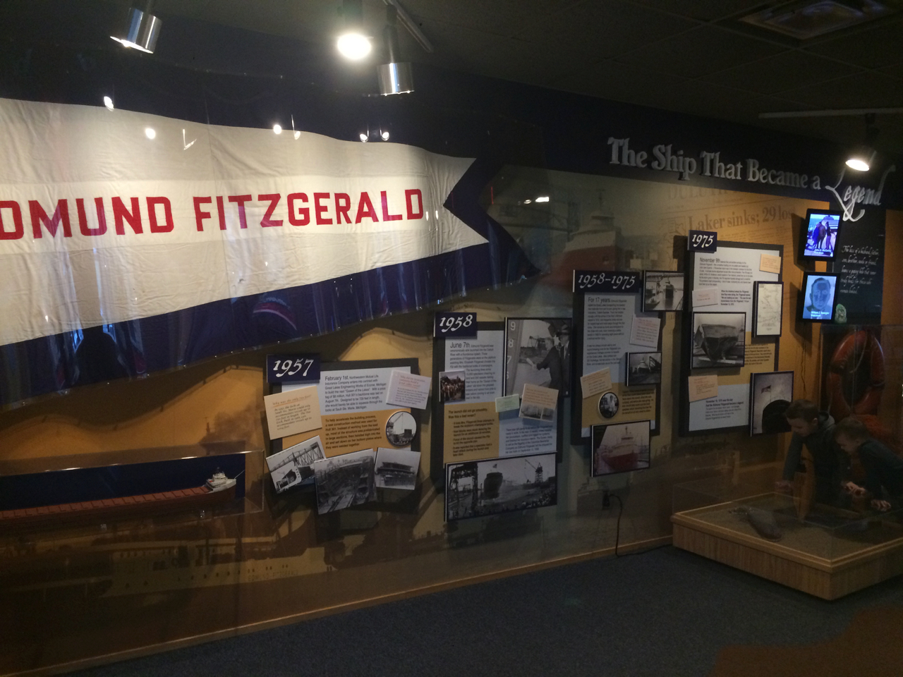
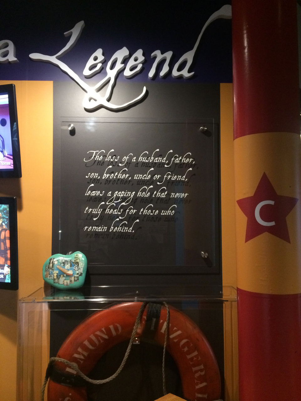
Living on the “North Coast” of the U.S., one has the tendency to contemplate Lake Superior. Every day the lake seems to offer up a different mood, a different palette of colors and textures. The lake also holds many stories. I have been working with the Maritime Museum for the past several years as they update and create new exhibits to tell the stories of ships on the lake, and the history of Lake Superior shipping as it relates to our world, country, region and city. Most recently, HotHouse designed the new exhibit on the Edmund Fitzgerald, with photos featured below.

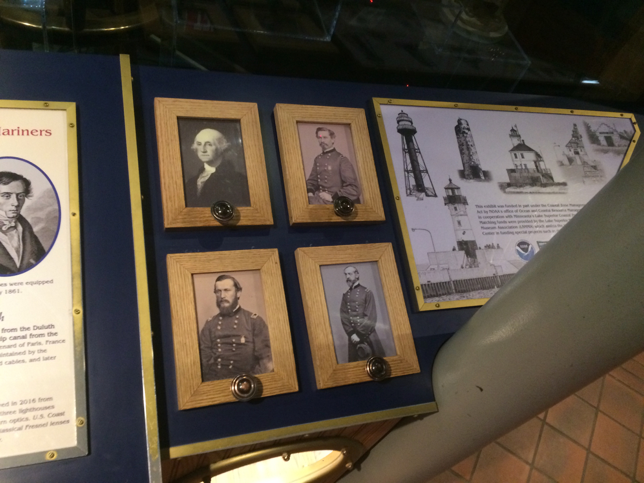
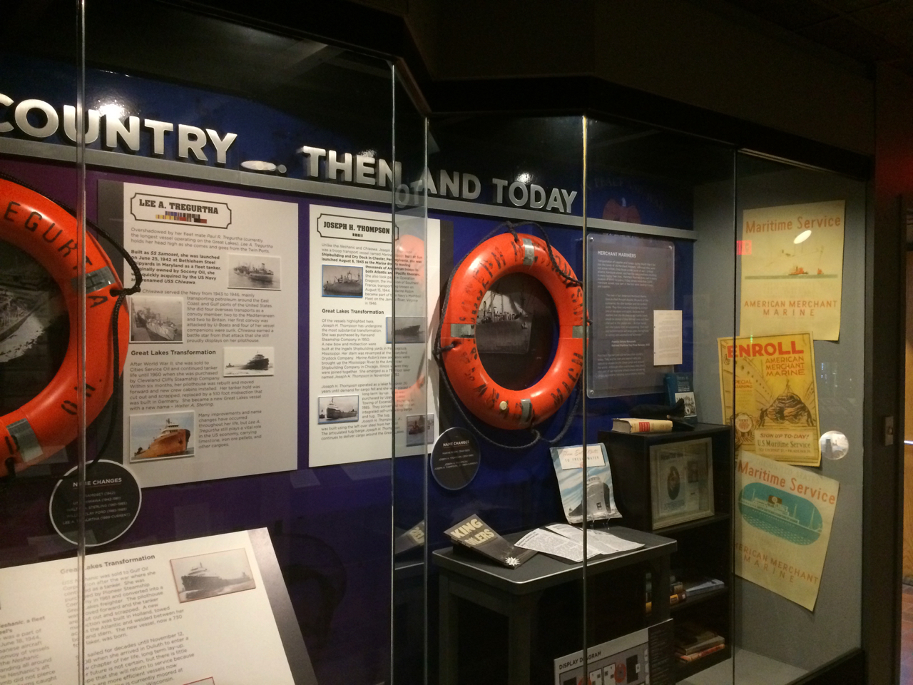
Prior to that, we designed an exhibit about WWII vessels that are still being used on the Great Lakes today. And before that, we were lucky enough to design an interactive exhibit about lighthouses on Lake Superior, collaborating with artist/sculptor/builder Gordon Manary on the 3D design of an interactive cabinet to display artifacts, engage younger visitors, and allow people of all ages to touch a smaller model of a lens.

IMG_3794.jpg
IMG_3796.jpg
IMG_3797.jpg

Below are a few photos of the WWII exhibit “Serving Our Country… Then and Today”

IMG_3776.jpg
IMG_3778.jpg

And finally, a few pictures of the Lighthouse exhibit and cabinet details

IMG_3781.jpg
IMG_3782.jpg
IMG_3786.jpg
IMG_3784.jpg

Designing a Logo for a Taco Arcade in Duluth, Minnesota

I absolutely love working with the folks of the Duluth Grill Family of Restaurants, which include OMC Smokehouse, Corktown Deli and Brews, and now Taco Arcada! This family-owned group of restaurants is setting the bar for delicious, local, hand crafted food not only in Duluth but regionally and nationally as well.

They are creative, ambitious, and they understand the connection of local farmers and food to our health and the economic sustainability of our communities. Plus, they are helping to revitalize and celebrate the Lincoln Park neighborhood of Duluth.

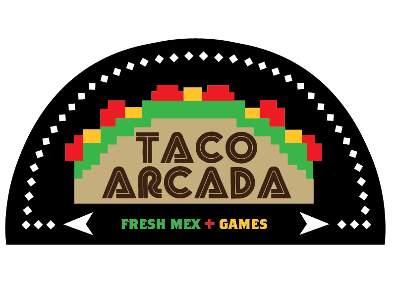
I was honored to design the logos for OMC Smokehouse, Corktown Deli and Brews, and now Taco Arcada. I was presented with the challenge of “an astroids-style logo” that communicated the restaurant concept: Fresh-Mex Meets Eighties-style arcade. At last, the logo versions are finalized. Cheers to the Duluth Grill Family of Restaurants for helping to keep Duluth cool! That was a play on words, by the way, because Duluth is a very cold place to live.

LongArtboard 1.png
Artboard 1.png

"Living Coral" in 2019

Pantone has chosen their Color of the Year for 2019, Living Coral. This bright, warm shade of pinkish-orange has been a favorite of mine these past few months, so I have to give Pantone their credit. Nice job, Pantone. This luscious color, along with the extraordinary generosity of many people in my life, inspired this hand painted Thank You note I made a few months back .
Thanks.jpg

Daily Life Inspires Art and Design

This post is mostly in pictures. I have drawn so much inspiration from little moments in life that unfold suddenly and capture the imagination. Sometimes I have been able to catch these moments as they fly past. Here are a few images of seemingly mundane moments that have revealed their hidden beauty and have made their way into my art/design work.

IMG_1021.JPG
IMG_3543.JPG
IMG_4629.JPG

Print Newsletters Help Keep Audience Engaged

I just wrapped up a flurry of newsletter projects and it caused me to pause a moment and reflect on how the printed newsletter is still an effective way to keep an organization’s audience engaged. Specifically, for organizations whose livelihood depends on the tourist season, a print newsletter is a meaningful communications piece that can keep the organization visible to it’s audience during the off-season. The cost is kept down by designing a template at the outset of the newsletter design process, and simply updating it quarterly or annually with new articles, photos, and other information. The organizational brand is maintained because the look remains consistent, and it makes the content-writing process easier when the design is already established. Two of my clients have been using the same templates I designed for them over eight years ago, and they still look fresh today. They feature coupons, articles, important contact information, fundraising calls-to-action, and photos that change throughout the year. Printed newsletters are still alive and well, and effective!

GLA_Currents_Dec2018pdf.jpg

HotHouse Celebrates 10th Anniversary

This week, we are breaking out the bubbly and tooting our party horns, because HotHouse is turning 10 years old! It has been an adventure with plenty of opportunities to learn and grow. We have designed wall-sized artwork for museum exhibits, produced web videos, TV ads, an infomercial and a 3-year long documentary video project. We have designed logos, many logos, and developed public awareness campaigns that spanned the web, the highway, TV and print. We have worked with amazing people, made many friends and creative compadres, and have been fortunate to work with organizations who are doing great things.

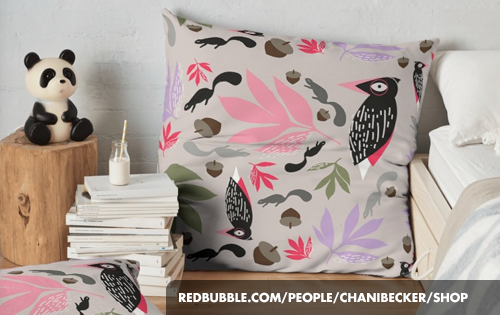
In honor of this momentous occasion, we are starting up something exciting here at HotHouse. This week we launch the HotHouse Shop on redbubble.com. You can visit the shop at https://www.redbubble.com/people/chanibecker/shop. Exciting! I’ll write more about it in the next post.

Mustachioed Santas

I have been working on several pattern design projects over these past few weeks. Just for fun, I joined an online design challenge of designing a vintage inspired holiday pattern that could be used as a holiday card. The result? Mustachioed Santas. Interested in purchasing a holiday card using this pattern? Or, wear the pattern to your next holiday party? We are currently setting up our online shop where you can purchase items using this pattern, and many other HotHouse original designs. Stay tuned for more info.

Creative Sandwiches Deserve Delicious Art

We just wrapped up these three illustrations for Corktown Deli and Brews, a mouth-watering sandwich shop and taproom in Duluth, MN. They asked me to illustrate their three most popular sandwiches: The Porcine Princess, The Knuckle Sandwich, and The Butcher On The Rye. The artwork will be used on the Corktown Deli t-shirts and perhaps in other ways as well. Handcrafted sandwiches deserve handcrafted art. Yum!

PorcinePrincess.jpg
Knuckle.jpg
ButcherOnTheRye.jpg